In the realm of programming, where lines of code dance across screens like digital poetry, the choice of a background color may seem like a trivial matter. However, seasoned developers know that the right background color can greatly impact productivity, readability, and even mental well-being during long coding sessions. In this article, we’ll delve into the nuances of selecting the perfect background color for your code editor, exploring various options and their effects on your coding experience.
The Power of Perfect Background Colors
Before we dive into the world of background colors, it’s crucial to understand their significance. A code editor’s background color serves as the canvas upon which your code is displayed. It sets the tone for your coding environment, influencing not only aesthetics but also practical aspects like eye strain and focus.
The Classic White Background
The classic white background, reminiscent of traditional text editors and early computer interfaces, remains a popular choice among programmers. Its simplicity and familiarity make it accessible to newcomers and veterans alike. The stark contrast between black text and a white background enhances readability, reducing the chances of errors due to misinterpretation.
However, the glaring brightness of a white background can be harsh on the eyes, especially during extended coding sessions. The intensity of the light can lead to eye fatigue and strain, potentially affecting productivity and overall comfort.
Embracing the Dark Side with Black
The dark background, often associated with “dark mode,” has gained immense popularity in recent years. Its sleek and modern aesthetic appeals to many developers, and for good reason. Dark backgrounds reduce the amount of emitted light, which can be a significant relief for the eyes, especially when working in low-light conditions.
Transitioning to a dark background may take some getting used to if you’re accustomed to the brightness of white. However, it can create a visually soothing environment that promotes focus and concentration. The lower contrast between text and background can also be less taxing on your eyes during those marathon coding sessions.
Beyond Black and White: Grayscale Variations
If you’re looking for something between the extremes of black and white, consider exploring various shades of gray. Grayscale backgrounds can strike a balance between readability and reduced eye strain. These muted tones are less intense than pure black or white, creating a comfortable visual atmosphere without sacrificing clarity.
Transitioning to a grayscale background can be a subtle yet effective way to fine-tune your coding environment. It’s a versatile choice that accommodates various coding styles and preferences.
Adding a Splash of Color
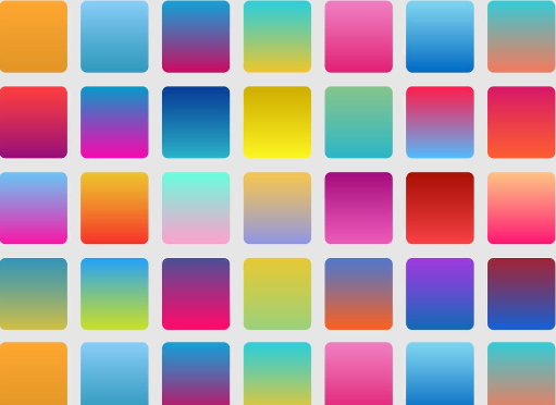
While monochromatic backgrounds have their merits, some developers opt for more vibrant backgrounds. Colored backgrounds can add a personal touch to your coding environment and help distinguish different sections of your code. However, using bright or overly saturated colors can be distracting and counterproductive.
When incorporating color, choose muted and complementary shades that enhance rather than detract from your code’s readability. Remember that subtlety is key; your background color should support your workflow, not steal the spotlight.
Perfect Background Colour

Considering Syntax Highlighting
Syntax highlighting, the practice of assigning different colors to code elements like variables, keywords, and comments, plays a significant role in readability. When choosing a background color, it’s essential to ensure that it complements your syntax highlighting scheme.
For example, if you prefer a dark background, bright and contrasting syntax highlighting colors will make your code elements pop, enhancing readability. On the other hand, a white or light gray background may benefit from more subtle syntax highlighting colors to avoid overwhelming the viewer.
Personal Preferences and Customization
Ultimately, the perfect background color for your code editor depends on your personal preferences and specific needs. The transition from one background color to another should be a deliberate choice based on your coding style and comfort.
Consider experimenting with different backgrounds and gathering feedback from colleagues or fellow developers. They may offer valuable insights or suggest alternatives that align better with your goals.
The Role of Ambient Lighting
As you make the transition to a new background color, don’t forget to take your physical environment into account. The lighting conditions in your workspace can significantly affect how your chosen background color appears on your screen.
If you’re using a dark background, ample ambient lighting can help reduce eye strain and maintain contrast. For light backgrounds, ensure that your lighting doesn’t create too much glare on your screen. Finding the right balance between ambient and screen lighting is crucial for a comfortable coding experience.
Conclusion
In the world of code, where precision and clarity reign supreme, the perfect background color of your editor is a decision not to be taken lightly. The transition from a classic white background to a sleek black one or the subtlety of grayscale can have a profound impact on your productivity and comfort. Remember that the best background color is a personal choice, one that aligns with your coding style and supports your overall well-being during those long hours of programming. So, take your time to explore the palette of possibilities and find the background color that enhances your coding experience.

