

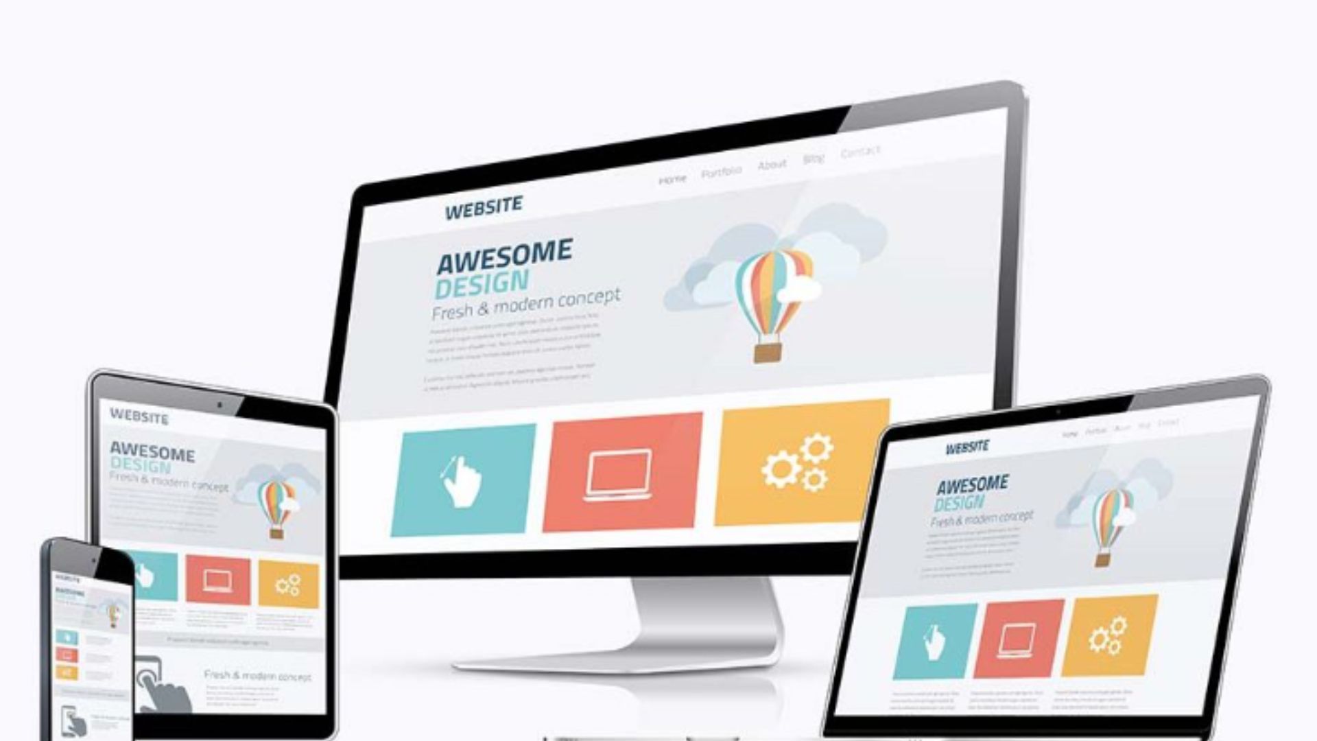
In today’s digital age, accessing the internet is no longer confined to desktop computers. Smartphones and tablets have become ubiquitous, allowing users to browse the web on the go. This shift in user behavior presents a challenge for web designers and developers: ensuring websites are not only visually appealing but also responsive across a diverse range of devices with varying screen sizes and resolutions. This is where the power of responsive design comes into play.
This blog post dives into the world of responsive design, exploring its benefits, key principles, and implementation techniques using HTML and CSS. By embracing flexible design, you can create websites that deliver an optimal user experience (UX) regardless of the device used to access them.
The Rise of the Multi-Device World
Gone are the days when websites were primarily designed for desktop computers. Today, users access the internet through an array of devices, from smartphones and tablets to laptops and desktops. In fact, mobile browsing has surpassed desktop browsing in many parts of the world. This shift in user behavior necessitates a flexible and adaptable approach to web design.
Here’s why responsive design is no longer a luxury but a necessity:
Enhanced User Experience
Users expect websites to be easy to navigate and visually appealing regardless of their device. Responsive design ensures that content is displayed optimally, buttons are easy to click, and information is readily accessible on any screen size.
Improved Search Engine Optimization (SEO)
Search engines like Google favor mobile-friendly websites in their search results. A responsive design ensures your website is properly indexed and displayed across different devices, potentially boosting your search ranking and organic traffic.
Reduced Maintenance Costs
Maintaining separate websites for desktop and mobile can be time-consuming and expensive. Implementing a single responsive website simplifies maintenance and updates, saving you time and resources in the long run.
Wider Audience Reach
By catering to a wider range of devices, you can reach a broader audience and potentially increase your user base. This can be particularly impactful for businesses and organizations seeking to expand their reach and attract new customers.
Responsive design isn’t just about adapting website layout; it’s about creating a seamless and consistent user experience across all devices. By prioritizing responsiveness, you ensure that everyone who visits your website can access information and engage with your content effectively.
The Responsive Design Toolbox
So, how do we achieve responsiveness? Here are some key techniques to employ with HTML and CSS:
Fluid Grid Layouts
Traditional fixed-width layouts struggle to adapt to different screen sizes. Fluid grid layouts utilize percentages instead of fixed pixels to define website elements, allowing them to adjust and resize based on the available screen space.
Media Queries
Media queries are CSS code snippets that allow you to target specific screen sizes or device types. By using media queries, you can define different styles for different devices, ensuring your website adjusts its layout and presentation accordingly.
Flexible Images and Videos
Images and videos can often become distorted or pixelated when displayed on smaller screens. Utilize responsive images with flexible scaling or employ CSS techniques like width: 100% to ensure images and videos adapt to the available screen size while maintaining their quality.
These are just a few fundamental techniques for achieving responsiveness. By combining these approaches effectively, you can create websites that seamlessly adapt to any screen size, delivering an optimal user experience for all visitors.
Advanced Responsive Design Considerations
While the core principles of responsive design are relatively straightforward, there are additional considerations for advanced implementations.
Responsive Typography
Fonts can appear too small or large on different devices. Responsive typography techniques like using relative font sizes (ems or rems) and adjusting line heights can ensure optimal readability across various screen sizes.
Progressive Enhancement
This approach prioritizes basic functionality for all devices while progressively adding enhancements for larger screens with more capabilities. This ensures everyone can access your website’s core content regardless of device limitations.
Performance Optimization
Responsive websites can sometimes contain more code than their non-responsive counterparts. Consider image optimization techniques and code minification to ensure fast loading times on all devices.
Conclusion
Continuously testing and refining your responsive design is crucial. Utilize browser developer tools and screen simulators to experience your website across a variety of devices and identify any potential issues that need addressing.