
In the vast and competitive landscape of the internet, making your website stand out is essential. While content and functionality are crucial, aesthetics play a significant role in attracting and retaining visitors. One of the key elements in web design is the choice of colors. The right combination of web colors can make your website pop and leave a lasting impression. In this article, we’ll explore the world of web colors and how to use them effectively.
Understanding Color Psychology
Before diving into the technical aspects of web colors, it’s important to understand the psychology of color. Different colors evoke different emotions and moods. For example, blue is often associated with trust and professionalism, while red can convey passion and urgency. Your color choices should align with the message and brand identity of your website.
Choosing a Color Palette
The first step in making your website pop is selecting a color palette. A color palette consists of a primary color and a few complementary colors that work well together. To create a harmonious palette, you can use color wheel tools or consult color theory. Analogous colors (those close on the color wheel) create a soothing effect, while complementary colors (opposite on the wheel) provide contrast.
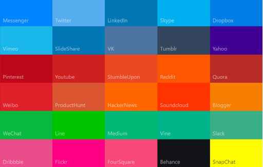
Web-Safe Colors
When choosing web colors, it’s essential to consider web-safe colors. These colors are universally recognized by all browsers and devices, ensuring your site’s consistency across platforms. The most common web-safe colors are variations of the 216-color palette known as the “web-safe palette.” Using web-safe colors prevents inconsistencies and ensures your site looks as intended to a broad audience.
Contrast for Readability
Legibility is paramount in web design. Your color choices should enable clear and effortless reading. High contrast between text and background is crucial. For example, black text on a white background or vice versa is a classic choice for readability. Be mindful of text sizes and font choices as well, as these factors play a role in overall readability.
Branding and Identity
Your website’s color scheme should reflect your brand identity. If you already have established brand colors, it’s a good idea to incorporate them into your website. Consistency across your online and offline presence strengthens your brand recognition. If you’re building a brand from scratch, consider the emotions and values you want your brand to convey and choose colors accordingly.
Using Color for Calls to Action
Moreover, Web colors play a vital role in guiding user actions. Calls to action (CTAs) should stand out. Consider using a contrasting color for buttons, forms, and other interactive elements. The color you choose for your CTAs can influence how users navigate and interact with your website.
Color Accessibility
Web design should be inclusive, and this includes considering the accessibility of your chosen colors. Some individuals have visual impairments that affect their perception of colors. Use tools and guidelines to ensure your color choices meet accessibility standards, such as providing alternative text for images and maintaining a high contrast ratio.
Testing and Feedback
The best way to ensure your web colors make your website pop is to test them. Show your website to friends, colleagues, or potential users and gather feedback on the color scheme. You may discover that certain colors don’t resonate with your target audience or that changes are needed for improved user experience.
Staying Current
Furthermore, web design trends evolve over time. What’s trendy today might become outdated in a year or two. It’s important to balance your brand identity with current design trends. Regularly updating your color palette and design elements can help keep your website fresh and engaging.
Conclusion
In conclusion, the choice of web colors is a powerful tool in web design. The right combination of colors can make your website visually appealing, convey your brand identity, and guide user actions effectively. Keep color psychology, accessibility, and readability in mind as you select and apply your color palette. With the right colors, your website can truly pop and leave a memorable impression on your visitors.