

CSS Grid and Flexbox have revolutionized the way we design layouts for websites. These powerful tools offer unmatched flexibility and control, allowing developers to create complex and responsive designs with ease. As 2024 approaches, CSS Grid and Flexbox are poised for even wider adoption. This post dives into advanced techniques for mastering these CSS layout methods, empowering you to craft stunning and user-friendly websites.
Understanding the Fundamentals
Before diving into advanced techniques, let’s solidify the foundational concepts. CSS Grid provides a two-dimensional grid system for positioning elements. You define rows and columns, and elements can be placed within these cells using grid lines. Flexbox, on the other hand, focuses on one-dimensional layouts. It allows elements to be arranged flexibly within a container, with options for resizing, alignment, and order.
Advanced Grid Layouts
CSS Grid goes beyond simple row and column definitions. Explore nested grids to create intricate layouts with sub-sections. Mastering CSS Grid involves utilizing grid-template-areas for pre-defining named grid areas, allowing you to easily place elements within these designated zones. Additionally, grid-auto-rows and grid-auto-columns enable automatic sizing and distribution of rows and columns, respectively.
Flexbox Mastery
While Flexbox excels in linear layouts, it offers powerful features for alignment and distribution. Mastering Flexbox involves leveraging properties like justify-content and align-items. These properties allow you to control how elements are positioned within the container, horizontally (justify-content) and vertically (align-items). Furthermore, the flex-grow and flex-shrink properties provide granular control over how elements resize and distribute available space within the container.
Adaptive layouts
A crucial aspect of modern web design is responsiveness. Both CSS Grid and Flexbox offer built-in features to ensure your layouts adapt seamlessly to different screen sizes. Mastering these CSS layout methods involves using media queries to define different styles for various screen sizes. Within these queries, you can adjust grid properties or flexbox properties to optimize your layout for various devices.
Grid and Flexbox Fusion
The true power of these CSS layout methods lies in their ability to work together. Mastering CSS Grid and Flexbox involves using them in tandem to create even more complex and dynamic layouts. Nest a flexbox container within a grid cell to achieve a mix of one-dimensional and two-dimensional layout control. This combined approach allows for ultimate flexibility and responsiveness.
Leveraging CSS Grid and Flexbox Libraries
While both CSS Grid and Flexbox offer extensive capabilities, libraries can provide additional features and shortcuts. Explore popular libraries like “CSS Grid Layout” or “Flexbox Grid” that offer pre-built grid and flexbox systems, simplifying the layout creation process. These libraries can act as a springboard for your designs, saving you time and effort.
Intuitive Design Tools
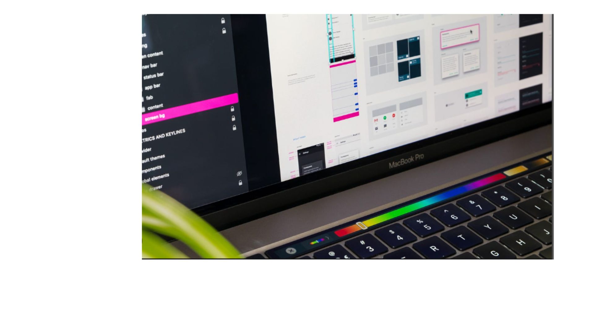
Mastering CSS Grid and Flexbox doesn’t have to be solely code-based. Several visual tools can enhance the workflow. Online tools allow you to drag and drop elements onto a grid or flexbox container, providing a visual representation of your layout. These tools can be particularly helpful for prototyping and iterating on your design before diving into the code.
Practice Makes Perfect
Mastering this requires consistent practice and experimentation. Set aside dedicated time to explore different techniques and build small design prototypes. The more you work with these methods, the more comfortable and confident you will become. Additionally, online challenges and tutorials provide excellent opportunities to test your skills and learn from others.
Conclusion
CSS Grid and Flexbox are powerful tools that empower you to create modern, responsive, and visually appealing websites. By mastering these CSS layout methods, you gain the ability to craft complex layouts with ease. Embrace the flexibility and control they offer, experiment with advanced techniques, and watch your website design skills elevate to the next level!